In the first of two technical articles, Stefano d’Andrea, Acus Srl, and Steve Donegan, Graphic Republik, discuss pre-press processes focusing on colour management. This includes looking at the recently published ISO standard for flexographic printing.
Back in 2006 at a colour conference in Valencia, a pre-press specialist from an international printing research organisation, took to the stage to discuss colour management. During the course of the presentation, the need for standardisation in the flexo industry was highlighted – cue laughter from the audience.
The general consensus was then (and possibly still is) that it was impossible to adopt a single flexo ‘standard’, similar to that enjoyed by the likes of the offset sector. For how, with such a wide range of printing machinery, methods of print, inks, ink sequence, anilox and print substrates, could a single standard be defined, let alone implemented?
Whilst the laughter invoked by the thought of such an idea may still echo today, times have changed and a new ISO standard for flexo was published at the end of last year. This article is the first of two technical papers offering colour management guidelines for flexo pre-press in 2013. The text includes reference to ISO 12647- 6:2012 Process control for the production of half-tone separations, proofs and production prints, Part 6: Flexographic printing.
Defining pre-press
Pre-press relates to the activities that need to be carried out in order that a graphic idea is printed as close to the original design intent whilst considering the technical features of the final printing system.
Every material used in print production, including plates and colour proofs, should be prepared according to, and reflecting, the final print conditions. But this is often not the case at the design stage as the final printing condition may not be known to the designer that prepare the artwork. So a generic print condition may be used in the early stages of the design concept to ‘guesstimate’ the final outcome.
It is left to the pre-press department to transform the original idea into a printable artwork. Prior to the artwork entering the pre-press arena, the original designs and related colour proofs are really only half-processed, semifinished works that must be adjusted for the actual printing condition, and further work must be carried out in order to adjust tonal values, colour output, trapping, etc, prior to the preparation of the printing plates.
We print to Fogra, don’t we?
Now let’s shake things up a little. For far too long, so called ‘industry experts’ have mislead the flexo fraternity into thinking that unrelated print standards can be applied to our sector. They can’t. The reason they can’t is due to the vast combinations of consumables, which are used, as highlighted above.
This is recognised in the text of ISO 12647-6, which states, ‘This edition of this part of ISO 12647 differs from the earlier edition by not defining specific printing condition aims but instead requires that a specific reference printing condition (characterisation data set) be specified.’
So the successful conversion of design through to print-ready artwork relies on obtaining the actual press characterisation data. This should involve a series of operations that capture the qualitative and quantitative characteristics of a printing system within clearly defined and controlled conditions. The relationship between the actual input CMYK data and the data derived from press characterisation will therefore describe how a particular printing system will reproduce a particular design.
Information obtained from this press characterisation procedure is used in pre-press via profiles for colour management: to convert from RGB to CMYK, to convert files that were prepared for different printing conditions, and finally, to make colour proofs. The information will also be used at the print stage as a reference to adjust the press and control quality in production.
The data should also be relayed further back to other stakeholders. Back to print buyers to define, communicate and agree what will be achieved on press; to designers to more accurately prepare jobs and for all parties to check conformity between proofs and print, according to the same expected and agreed tolerances.
Profiles and spot colours
Colour conversion of CMYK components is likely to be carried out by programs based on device link profiles that ensure optimum rendering and colour accuracy, while maintaining defined conditions such as black generation, clean primaries and overprints.
Packaging designs and artworks, however, are often created with more than a standard CMYK colour set. Special colours are included to preserve the accuracy of brand logos, widen CMYK gamut, assist CMYK reproduction or split colours to overcome press technical limitations. These spot colours may print as solid or tones, they can be replacements or additions to CMYK colours, or they can act as reinforcement colours to CMYK channels.
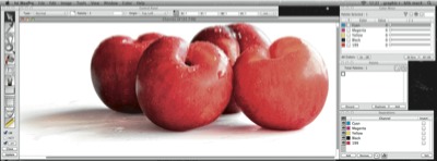
The human eye is sensitive to colour hue changes: if a red apple, while printing, is subject to magenta and yellow due to dot gain variations, we might see it turning toward an orange or pink colour. Certain flexo printing conditions will be affected by variations in dot gain levels and when these deviations occur on CMYK colours, the colour hue will change, creating an undesirable effect.
By adding or replacing these colours with a supplementary red channel, printed with red ink, the apple image will still be subject to the same dot gain variations, but changes in hue are markedly reduced and indeed, the image will appear more vibrant.
Adding spot colours into an image to avoid ink hue shifts or to enhance its appearance brings its own challenges. Generic DTP software applications, such as Adobe Photoshop, rely on ICC profiles, which are unable to render these spot colour channels accurately on screen. This results in a large amount of both guesswork and time wasted retouching images. Dedicated software, developed specifically for the flexo industry, addresses this issue, allowing the operator to carry out this spot colour conversion and editing, whilst accurately viewing on screen how the final image will look on a particular press.
 Specialist colour conversion applications render spot colour channels correctly on screen
The proof
The proof stage is arguably the most critical within the pre-press process, since it is at this point that the customer is provided with a visual of how their final printed piece will look and upon which contractual agreement is made. The proofing system utilises the press characterisation data to build a colour profile which is applied to incoming files and this profile, if generated correctly, will allow the resultant proof to closely resemble the final printed piece.
As inkjet printing devices are commonly used to produce these final proofs, the original ink sets need to be manipulated to take into account the ink hue, grey balances, dot gain and overprints found on press.
The incoming file format for these proofs should be in a form that will allow the final inkjet proof to accurately represent the final printed piece. It is for this reason that a Raster proof, generated using 1-Bit Tiff or Len file formats is favoured. A dedicated flexo proofing system using Raster data allows the customer to see how the dot structure and appearance can influence the visual effect of the final print. Consider the same imageprinted at 65 lpi, 100 lpi and 150 lpi and how much of an impact this screening has on the resultant print.
The proofing system should also faithfully reproduce other elements that may impact the original design: elements such as rosettes in images and other tonal areas, the appearance of trapping and how this affects colour and how colours interact when overprinted.
Accurate spot colour reproduction is also sought on the final proof. With the latest ink sets available in devices such as the Epson Stylus Pro series with its additional orange and green inks, this is now achievable for the vast majorityof target colours.
With the advances made in inkjet technology, proofs can now be created on multiple substrates such as film and metallic media with the added appeal of printing with a white ink, surface or reverse, to further mimic the final printed piece. A control strip printed automatically on each proof allows the operator to monitor and maintain the output quality.
And so to output
Once the proofing stage has been passed, files are available for imaging to plate with RIP curves for eventual dot gain compensation applied – the same data as calculated and used to provide characterisation, in order to ensure output consistency.
Whilst not entirely colour related, the dot structure used at platemaking stage will have an impact on the visual print. For a number of reasons, the smallest dots appearing in highlight areas require particular attention and the choice of the appropriate algorithm for screening is vital to achieve optimum results during the print run.
Whilst FM or hybrid screening systems have been heavily marketed in recent years, these can actually cause more problems in the pressroom, particularly in highlight areas. To maintain maximum consistency and repeatability, proven AM screening is advocated due to its stability both in platemaking and print stage. AM screening is by no means outdated and some clever or ‘Smart’ AM screening technologies have recently been adopted by repro houses in Europe.
In conclusion
The quality of production will never be higher than the quality of measurements and the value of characterisation. The predictable quality of a consistent process can only be ensured when the full process is managed and kept under control.
A statistical approach will help to determine and better understand the process variability and its tolerances. This is particularly true when capturing characterisation data while fingerprinting: data should be statistically significant and representative of the process in its average behaviour, as all pre-press editing and proofing will be based on this data.
The more we move our approach to printing and pre-press towards ‘working by the numbers’, the more productive and efficient workflows will be, with less subjectivity, higher quality and repeatability and greater customer satisfaction.


Hi am a printing student in Kenya interested in venturing into flexo printing, I learnt there are specific angles used for process colours when ripping artwork, are there specific angels for spot colors too?
Thanks