Flexo printed shelf ready packaging is giving Propercorn added stand out in the snacks category
Propercorn’s irresistible combination of a healthy constitution and stylish good looks is attracting plenty of admirers in the snacking category, reports Des King. Helped not least by high quality, flexo printed shelf ready packaging.
Suddenly, snacking in between meals is becoming a healthier option for brand owners and consumers alike. Whether it’s high fruit natural content nibbles strategically sited at the supermarket check-out to fill the vacuum left the by the phased withdrawal of anything containing excess sugar, or the rapid expansion of ‘free from’ desserts and convenience products for on the go consumption, grazing is the new gorging.
According to recent research conducted by Innova Market Insights, the primary consumer demographic for healthier snacks is aged 15 to 35; the self-styled ‘millennials’ that comprise around one-third of the global population. Less wedded than older generations to a set regime of three meals a day, it is a target market that considers snacking as a top up or a boost rather than a treat.
And for a consumer profile that tends to be more self-conscious than most in recognising that we are what we eat, arguably the trendiest as well as healthiest snack in which to indulge is popcorn: chock full of antioxidants – the natural antidote to free radicals; high on fibre, and with a weight-controlling low calorie count. All of which has turned what was hitherto predominantly a cinema-going snack into the snacking sector’s most dynamic subcategory, with overall popcorn sales up by over 38% in the UK alone.
Setting the trend
A significant factor helping to drive the snack’s re-invention of itself as a health food has been the emergence of so-called posh popcorn brands utilising natural ingredients to offer eye-catching flavours. One such brand is Propercorn: only fully commercialised in 2013 but already targeted to achieve sales close to €20 million this year.
Its range of distinctive flavours sells at a rate of 2 million packs each month via 8000 UK stockists, such as Waitrose, Tesco, Selfridges, Harvey Nichols and Planet Organic. And with interest now building throughout North America and Europe, the brand is well on the way towards developing a global presence.
Propercorn is the brain-child of bright young British entrepreneur Cassandra Stavrou, who initially spotted the possibilities open to the development of a nutritious low calorie five years ago. ‘I could see there was an opportunity for a snack that’s not only tasty but also naturally healthy. Everyone understands popcorn. It’s not a super-niche product, but one that if it’s done in the right way can be good for you. It is inherently a ‘free from’ product, but a lot of the processes it goes through and the seasonings that are used can make it difficult to declare as being gluten-free, which was particularly important to us. I basically set out to create the snack that I would be thrilled to buy into myself.’
Using her own preferences as a benchmark to being her own ideal customer has paid dividends. Propercorn has proved to have instant appeal particularly amongst those self same time-poor young professionals that she once was, and looking for a snacking product that fits in with their lifestyle, not least by containing under 100 calories per single serve pack.
It has also struck the right note among the chattering classes by being regularly endorsed as the official snack at London Fashion Week, where that ultimate arbiter of good taste Vogue editor Anna Wintour has been spotted tucking in to a bag whilst sitting it out on the front row. ‘It’s given us an amazing platform from which to reach out to a very switched-on and influential demographic,’ says Ms Stavrou in something of an understatement, and about as telling an endorsement an embryo brand could hope to get.
Attention to detail
A high degree of personal care and attention in recreating the original provenance of the brand has also been extended to Propercorn’s sales and marketing strategy.
‘From a design perspective I’d say that a lot of healthy products have been presented in quite a bland and unimaginative way in the past, and just haven’t been particularly inspiring to look at,’ says Ms Stavrou. ‘By the same token, we didn’t want to just deliver to store in a basic brown cardboard box. Also, if you look at the snack shelf in any supermarket it can be really quite cluttered and noisy. We saw the opportunity to create something a little bit different that would stand out by being less garish, and that if anything was under-stated and thus more stylish.’
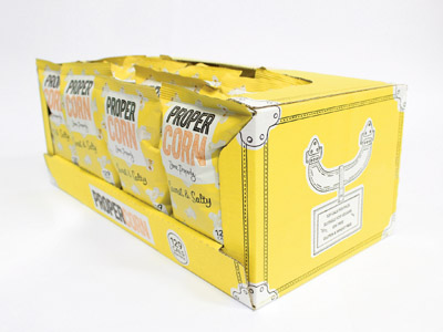
The impact that Propercorn creates in store as being a little bit different from the rest of the pack is due to the shelf-ready packaging (SRP) solution developed by specialist corrugated supplier Nelsons for Cartons. Originally founded 80 years ago as a family-run business supplying wooden crates, the Leicester-based company has latterly built up an impressive track record in project managing innovative iterations of the SRP format since managing director Gary Mason rescued the business from the verge of going under in 2002. Whilst design is done in house, material and machine time is sourced across the corrugated trade.
According to Mr Mason, the original brief was mainly focused on addressing logistical supply chain issues, notably by improving upon pallet-load capacity from 56 up to 72 filled cases. The overall job was six months in development with on-shelf differentiation and standout more or less an unanticipated bonus. ‘By switching from a conventional B to a 2.5 mm flute, we were able to achieve a 28% uplift on pallet capacity as well as providing a far better print surface for a far superior solution to the previous application.
‘The box holds 24 single serve packs and is made up out of a single piece of 150 gram white Kraft board. It’s flexo printed in three colours, rotary die-cut and glued in a single pass on a case-maker machine at a rate of 10,000 per hour. When it gets to store, it’s simply turned on its side for the front panel to be removed prior to it being placed on the shelf. No difficulty in tearing, no ragged edges, no ripping the print and a perfect display face – there’s nothing within the category that looks anything like it or in any way as distinctive.’
The previous SRP format was a standard box with flaps on the top and the bottom and a central perforated punch-out panel that when removed was able to display and dispense the contents. What was reasonably serviceable at point of purchase, however, was inefficient in transit; because the bags had to be stacked horizontally rather than standing up, the outer boxes had to be that much bigger to basically allow for all the air in the bags. Conversely, packing the bags on top of one another, storing them flat on their face and transporting them in the same position achieves the optimum footprint for palletisation.
Designed to delight
Whilst not replicating many of the features of the gravure printed primary pack originally designed by commercial illustrator Zoë More O’Ferrall – whose work is featured regularly in Vogue and the New York Times magazine – and subsequently refreshed by in-house artist Edward Wood, the SRP case has been successful in matching the Pantone colours as closely as possible.
In its present guise, on case have majored on stressing the products’ low calorie content and supporting the brand mantra ‘Done Properly’. A welcome addition, however, might be the inclusion of Propercorn’s colourful, signature popcorn pattern captured by top food photographer Rob White, whose work has helped to illustrate products from blue-chip FMCG brands such as Nestlé, KP and Heinz.
Bringing to life what is basically an inanimate foodstuff was not a straightforward task, says Mr White. ‘It’s similar to potato chips because it’s so light. The challenge is to make it as 3D as possible in order to bring out the texture. One of the pitfalls to be avoided as with any white coloured product is the risk of it appearing to have a greyish hue, which we managed by shooting individual pieces of popcorn mounted on dressmaker’s pins to raise them up from the surface so that there were no shadows.
‘We aimed to give the product some added personality by picking out pieces that seemed to resemble recognisable shapes and images, much as you might see when looking at clouds. It was quite a time-consuming process at the end of which out of the 60 or more pieces of popcorn we photographed only one-third were finally used.’
Those fluffy popcorn images are very much to the forefront of Propercorn’s latest promotional campaign developed in conjunction with acclaimed set-designer and art director Rachel Thomas: a series of interactive installations brightening up everything from buildings and pavements, to shabby phone boxes and Routemaster buses in central London over the summer months. The campaign is wholly in keeping with Propercorn’s highly individualistic way of promoting itself. ‘We were tired of brands telling us what to do and when to do it,’ says Cassandra Stavrou. ‘This brings theatre to the streets of London. It says more about our popcorn than words ever could.’

