Colour matching for flexo using PantoneLIVE (3)
The variety of printing processes and substrates used in packaging makes delivering accurate, reliable colour a real challenge for graphic designers, but there is hope for a simpler process when colour is communicated digitally.
Great colour is critical in packaging, but is it so complicated that it is best left to repro houses and printing companies?
Specification of colour for packaging begins long before the job arrives at the printer. And sometimes this means that it is difficult – or even impossible – to actually print the specified colours using the target substrates and printing processes. Designers and brand owners would, of course, like to avoid this expensive proposition by ensuring that the final drafts of a packaging design clearly indicate the colours that can actually be achieved during production. This is facilitated when the brand owner, design agency and repro house are using a shared, digital database (also known as asset management). But it must go a step further in order to ensure that colours can be reproduced as expected.
PantoneLIVE is a cloud-based eco system that greatly simplifies communication of colour throughout the entire supply chain, from design and specification through production. It also allows designers and brand owners to predict exactly how colours will look on the target substrate and using the desired printing technology and inks before files are ever sent to the printer.
Universal colour language
PantoneLIVE enables the universal Pantone colour language to be accurately communicated among brand owners, designers, pre-media, ink suppliers and the pressroom with no ambiguity, breaking down the silos in the colour workflow.
The PantoneLIVE team works with printers, converters and other stakeholders to define, develop and deploy accurate colour specifications, based on specific substrates, print processes, inks and application methods. Precise spectral definitions for each colour are organised in a secure cloud-based eco system accessible to all authorised stakeholders across the global supply chain. Brand integrity and design intent are assured, regardless of print surfaces, production processes, technologies, skill sets, people or geography.
During implementation, master standards are defined for each colour within selected colour palettes. These are spectral values based on Pantone identities that represent the true colour as specified. Sometimes, due to the realities of production materials and processes, the desired master standard colour cannot be fully achieved with the target substrate and printing process. Dependent standards are expressly designed to represent desired master standards, while taking into account the effect on colour outcome of using various different substrates and printing processes.
PantoneLIVE also provides designers working in Illustrator with special colour libraries; for example, for flexo printing on various flexible packaging types, paperboard or corrugated board. These PantoneLIVE colour libraries are also available for proofing solutions as well as for accurate, error-free ink formulation by printers/converters or ink manufacturers.
Simply put, PantoneLIVE ensures accurate, consistent colour communication across the entire supply chain, from design through production, using digital colour standards and a common colour language.
A case in point
A good example of PantoneLIVE in action is a printing company that wants to test how well it can achieve a specified colour, such as Pantone Coated Reflex Blue. It can use its printing inks and special laboratory printing devices on the target printing substrate to produce colour recipes for individually mixed, optimum printing inks with data drawn from the PantoneLIVE database.
During this process, it may be discovered that Pantone Coated Reflex Blue cannot be produced with a satisfactory level of accuracy. However, all too often, this occurs just as the job is being prepared to print, and it is late in the game for the customer to have to make decisions about compromises that may be required to achieve the desired colour using the chosen substrate and printing process. Since the ink recipe is usually produced at a relatively late stage of production, this information is often not available when the print-ready proof is produced. And this can cause project delays as well as customer dissatisfaction.
In this scenario, the print-ready proof is actually of very little value for determining the accuracy of the special colours. Since all PantoneLIVE digital colour libraries are tested with real printing inks on real substrates, these digital standards are ideal for directing the formulation of ink recipes in the print shop, allowing the colour defined in the design and proof to be reliably produced as specified. Even more important, when PantoneLIVE is part of the workflow, the customer sees colours that can actually be produced in the print shop during the design phase and on the proof.
In the real world
Unfortunately, in any production operation, minor mistakes can occur in the production chain that result in an unusable product and the need for rework.
This following example is based on a real scenario, however, changes to the story have been made to protect confidentiality.
An international clothing manufacturer arranged for hangtags to be produced for its latest collection. These were to be printed in Pantone colours 7465U and 7499U on a brown, uncoated paperboard. The designer simulated the brown paperboard in the design in a separate layer plus the Pantone colour. A proof was produced on this basis and sent as the specification to the print shop 12,000 km away.
Using this proof, the print shop tried to simulate the design intent as best it could. However, it was only able to produce a much darker result and therefore much less of a contrast with its printing ink. The printer decided not to have the colour approved by the customer in advance and printed the entire run of 300,000 hangtags.
As you might imagine the customer wasn’t happy, and the entire run had to be printed again. The print shop had to bear most of the costs, but the customer was partly to blame because he didn’t send the print shop a proof matched to the printing process. The delivery of clothes with hangtags was delayed by several weeks. All in all, this was a costly experience for everyone. Now let’s see what would have happened with PantoneLIVE in the mix.
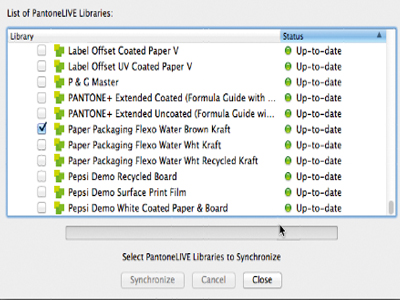
Choice of PantoneLIVE libraries for flexo printing on brown paperboard (2)
Alternative process
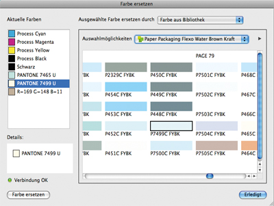
The first draft of the tag, as envisaged by the designer, uses the colours Pantone 7465U and 7499 U. The paperboard is simulated in Adobe Illustrator using a separate layer (1). Illustrator is now simulating what the final result would look like using flexo printing on brown paperboard. To do this, the designer logs out of Illustrator and into the PantoneLIVE cloud and selects the appropriate PantoneLIVE colour library (2). Next the designer replaces the design’s Pantone colours with those from the selected library (3). The preview in Illustrator taking into account the final substrate where the hangtag is to be printed now shows a dramatic reduction in contrast (4). To achieve a better contrast one alternative would be to print on to a white paperboard or to pre-print in white before printing the actual special colours on the brown paperboard substrate (5).
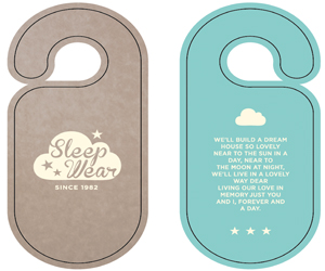
Hangtag viewed in Adobe Illustrator with standard Pantone colours (1)
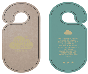
Illustrator review of flexo colours on paperboard (4)
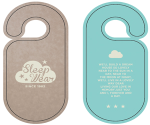
Preview of optimised flexo colours with white pre-printing on paperboard (5)
Right from the design and/or final artwork phase, PantoneLIVE allows the interaction between substrate, printing process and ink to be evaluated without the designer even needing to know which print shop will be used. The brand owner sees drafts that can be realistically achieved. The repro house can define special colours more accurately in the proof, and the print shop receives a specification that it can realistically reproduce in the ink recipe.

